|
|
Post by ummwat on Jan 21, 2013 2:15:51 GMT
|
|
|
|
Post by Buzz Carols on Jan 21, 2013 3:42:18 GMT
Very cool! Love the second one especially.
|
|
Blasted Marble
Professional Marbler
 Interior Creator[ss:Default Skin]
Eight MBP World Records Acheived
Interior Creator[ss:Default Skin]
Eight MBP World Records Acheived
Posts: 371
|
Post by Blasted Marble on Jan 21, 2013 16:16:38 GMT
Excellent pictures! Sweet modifications too.
|
|
Pyro
Advanced Marbler
[ss:Dark Winter]
Very Excited for MBP 1.50!
Posts: 322
|
Post by Pyro on Jan 21, 2013 16:26:27 GMT
That looks really nice!  |
|
|
|
Post by Beack on Jan 22, 2013 2:14:43 GMT
I like the second one more than the others, but overall nice looking.
|
|
|
|
Post by Jeff on Jan 22, 2013 2:29:16 GMT
I agree with Beack and AJDallas, the 2nd one is my favorite out of the bunch.
|
|
|
|
Post by ummwat on Jan 22, 2013 3:57:41 GMT
Thanks! =P
|
|
|
|
Post by Pablo on Jan 22, 2013 4:59:25 GMT
Nice logos!
|
|
|
|
Post by ProMarbler on Jan 22, 2013 14:26:40 GMT
Redesigning the release logo right? 'Cause 1.20 has a new logo.  Otherwise, not bad. Vote #2 out of all, anyone notice the glow? |
|
ChaosUnown
Experienced Marbler
MB Interior Graphics Designer
Posts: 126
|
Post by ChaosUnown on Jan 27, 2013 16:21:25 GMT
It looks decent, and the color scheme is pretty well chosen. Some things that bother me though is the yellow glow behind it, as well as how unsmooth the text is. This is a good start, but I personally think it needs a lot more work.
|
|
Hagaroo
Professional Marbler
MBU Glitch Expert[ss:Default Skin (DO NOT TOUCH)]
The nth dimension...
Posts: 476
|
Post by Hagaroo on Jan 28, 2013 0:10:11 GMT
Like everybody else, #2 has to be my favorite. There are some cosmetic issues as Chaos mentioned but it looks pretty good  |
|
๖ۣۜAddict™
Advanced Marbler
[ss:Resurrection]
ツ ツ ツ ツ ツ ツ ツ ツ ツ ツ ツ
Posts: 312
|
Post by ๖ۣۜAddict™ on Feb 3, 2013 22:18:39 GMT
It looks decent, and the color scheme is pretty well chosen. Some things that bother me though is the yellow glow behind it, as well as how unsmooth the text is. This is a good start, but I personally think it needs a lot more work. Chaos, I don't think he Photoshops. <----- meme reference. OT: I like the remake. It could be a bit better but there's always room for improvement. |
|
Aether
Beginner Marbler
lol how do i marble
Posts: 50
|
Post by Aether on Feb 5, 2013 19:24:15 GMT
Here's one that I made a long time ago but never had any real use for...  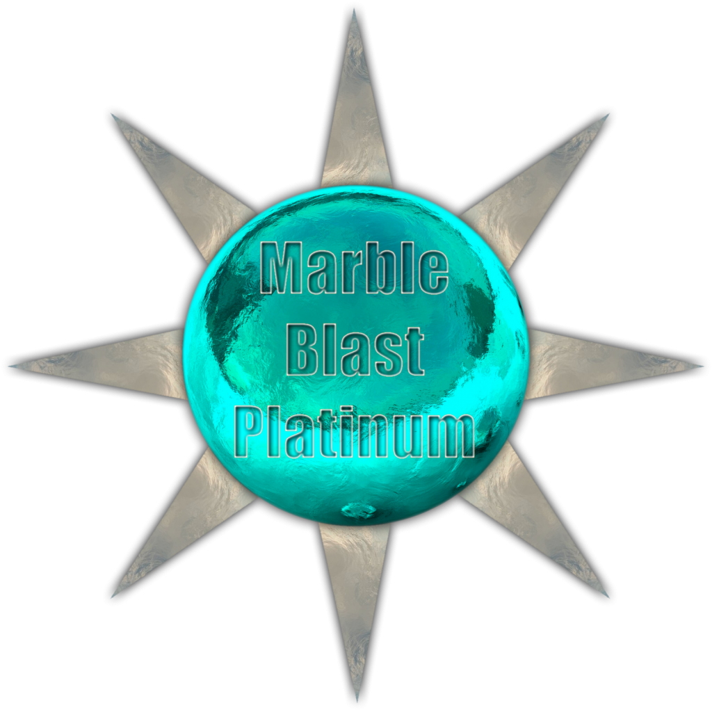 |
|
|
|
Post by ummwat on Feb 5, 2013 23:16:31 GMT
Here's one that I made a long time ago but never had any real use for... ... That looks pretty nice! It kind of has an industrial feel to it. However, the text in the second picture is kind of... ugly. Okay, really ugly. Aside from the text, it's pretty good. The fact that the spikes on the edge of the sphere are longer than usual kind of looks better at a higher resolution, too. /critic |
|
|
|
Post by Jeff on Feb 5, 2013 23:30:37 GMT
Aether, those are awesome man, I like both of them!
|
|
|
|
Post by Beack on Feb 6, 2013 0:02:46 GMT
The first looks great, the text kinda killed it, did you used an enviro for the /kinda reflection?
|
|
Hagaroo
Professional Marbler
MBU Glitch Expert[ss:Default Skin (DO NOT TOUCH)]
The nth dimension...
Posts: 476
|
Post by Hagaroo on Feb 6, 2013 0:58:11 GMT
I think you'd be better off putting the text on either side. Besides that, I think it looks excellent.
And I love how the spikes have a "platinum" sheen to them.
|
|
ChaosUnown
Experienced Marbler
MB Interior Graphics Designer
Posts: 126
|
Post by ChaosUnown on Feb 6, 2013 1:30:38 GMT
I agree with Beack in that the text looks pretty off. I would try experimenting with different text effects. Other than that I like the image a lot, good color usage too.
|
|
|
|
Post by Buzz Carols on Feb 6, 2013 2:31:56 GMT
Maybe if the interior of the text was a bit darker, it would stick out better. But I think it looks pretty good. I like the color choices and the glassy texture. |
|
|
|
Post by Pablo on Feb 6, 2013 6:32:33 GMT
The logo alone looks great!
|
|
|
|
Post by Elektrix on Mar 5, 2013 20:27:46 GMT
Very nice look of MBP |
|